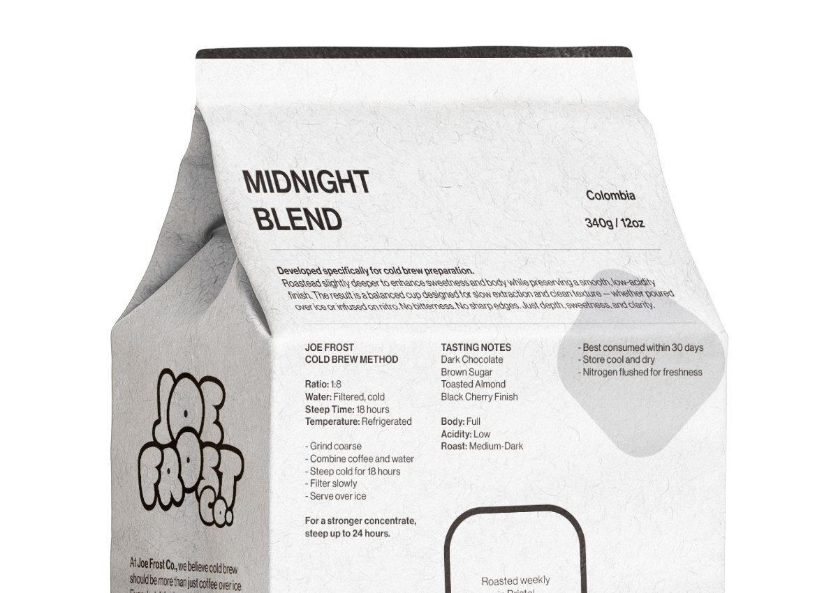
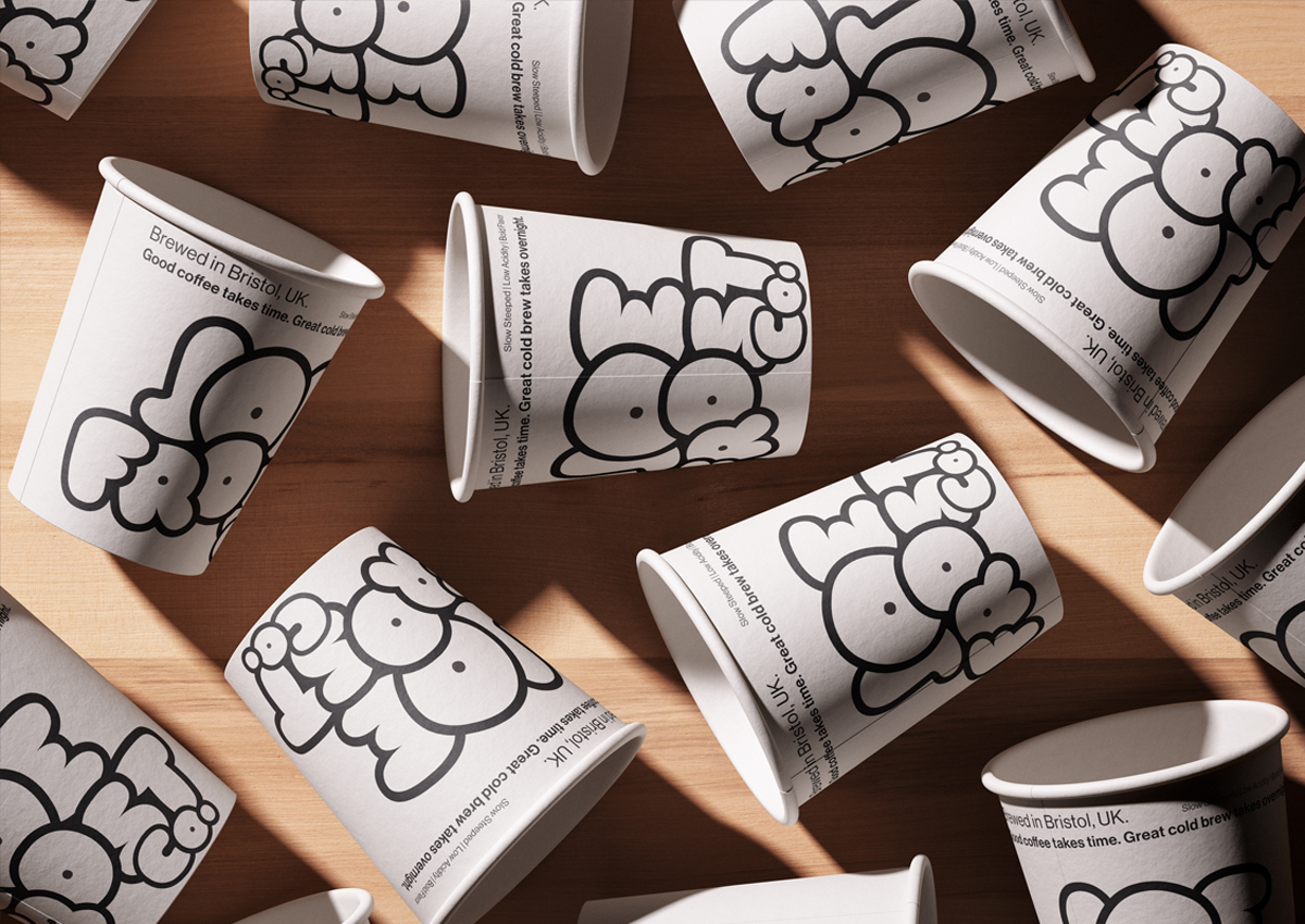
Joe Frost Co. is a conceptual branding project for a contemporary cold brew coffee company based in Bristol’s Harbour District. The project explores the creation of a distinctive urban coffee brand from the ground up, combining a playful visual identity with contemporary design language. Developed the complete creative direction, including naming, logo design and animation, brand identity, visual language, packaging, communication assets and digital experience. The project also included the design and development of a dedicated landing page, bringing together the brand story, coffee range, physical space, community and online shop into a cohesive digital experience.
Conceptual project.
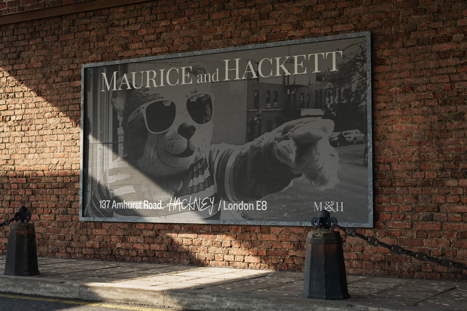
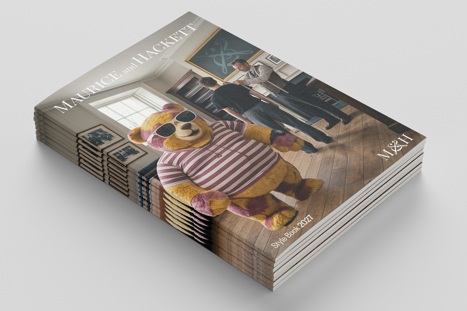
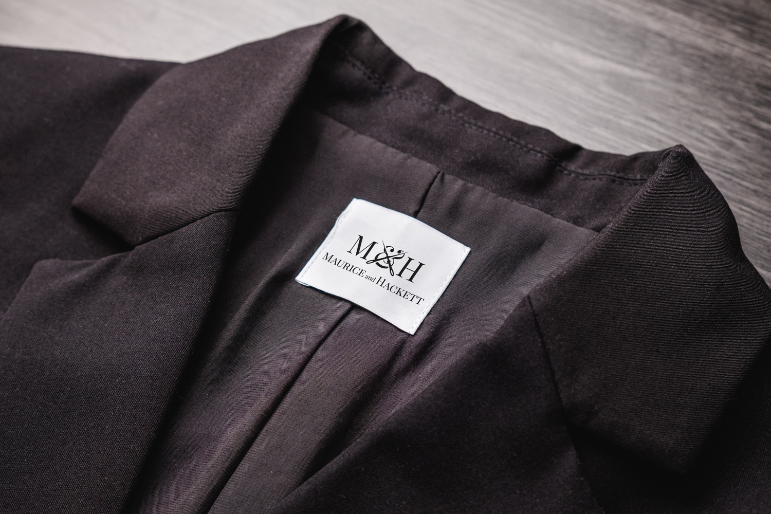
MAURICE and HACKETT
Maurice & Hackett needed to stay true to its East London tailoring roots while speaking to a new, style-savvy generation. I developed the full campaign — handling art direction, logo design and animation and end-to-end execution of an AI-driven branded storytelling film — blending craft and contemporary visual storytelling to turn the brand into a genuine cultural reference for London's urban scene. SOUNDON!
Conceptual project.
HBO "Who Killed Biggie and Tupac?"
I led the art direction, video editing and motion design for the opening sequence of the HBO documentary Who Killed Biggie and Tupac? — crafting a visual identity built around one of hip-hop's most enduring mysteries. The approach balances investigation, legacy and cultural weight without tipping into sensationalism. The result delivered a distinctive piece that captured both the historical weight and contemporary relevance of the story. SOUNDON!
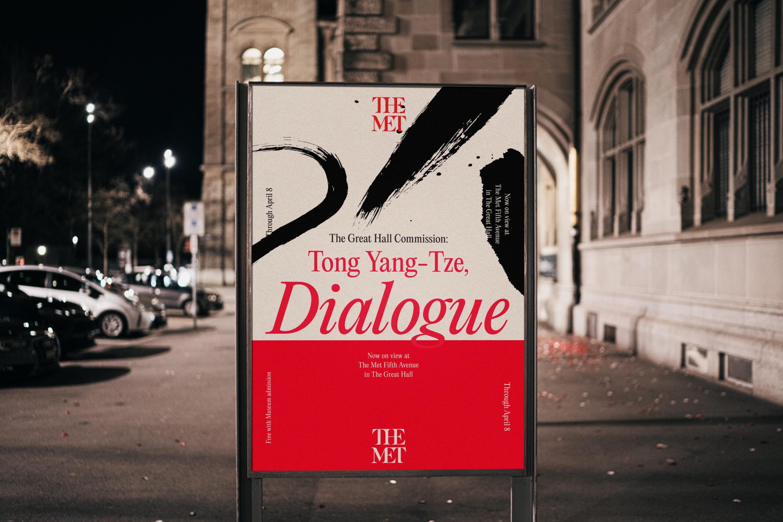
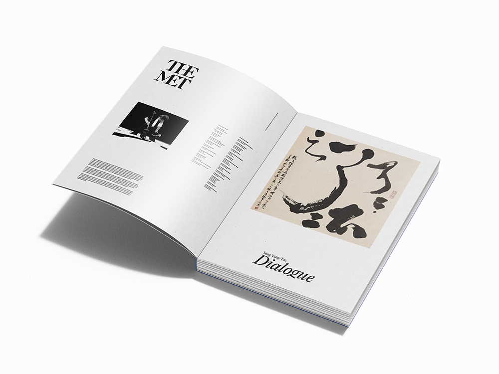
The challenge was to create a visual system capable of translating Tong Yang-Tze’s expressive calligraphy into a contemporary exhibition experience. Through typography, motion and editorial design, the project aimed to balance cultural heritage with a clear and engaging visual language. The result was a cohesive identity that extended across print and digital applications.
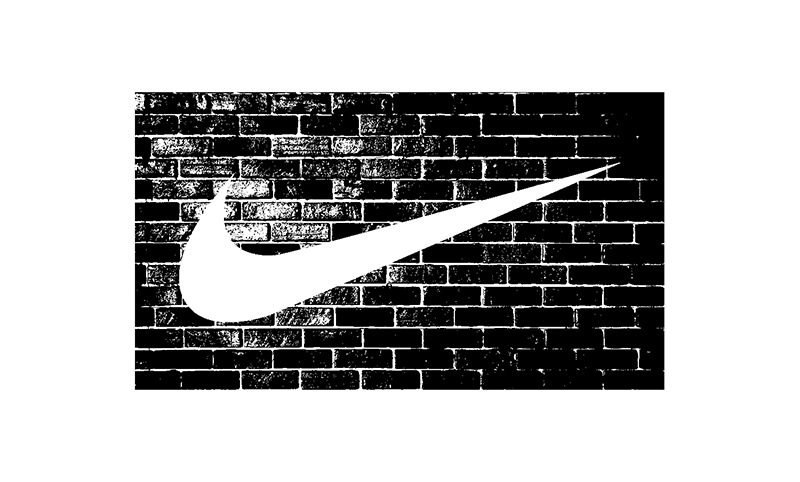
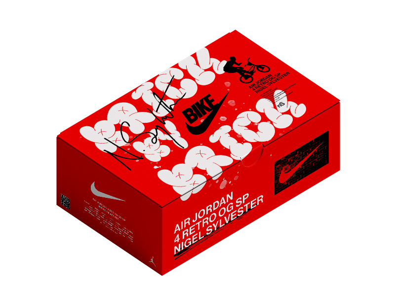
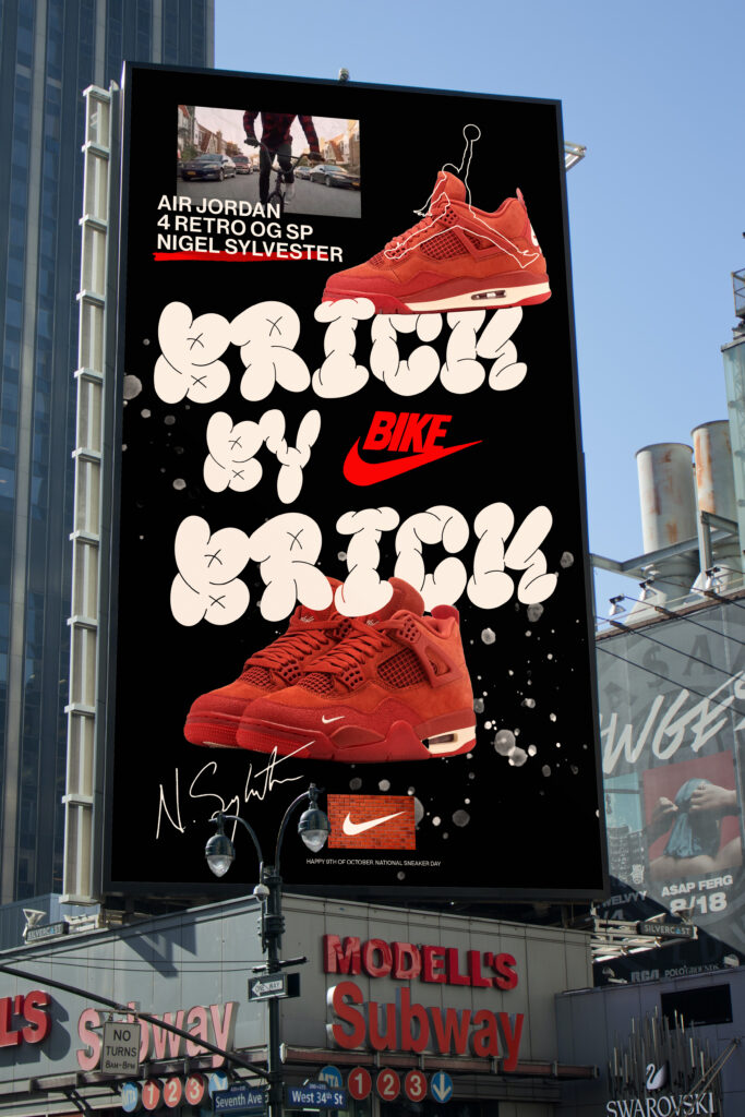
Created to celebrate Sneaker Day through the launch of the Nigel Sylvester Air Jordan 4, the project needed to capture the energy of sneaker culture while building a distinctive campaign universe. Inspired by street art, movement and urban storytelling, the identity connected packaging, motion and graphic design into a single narrative.
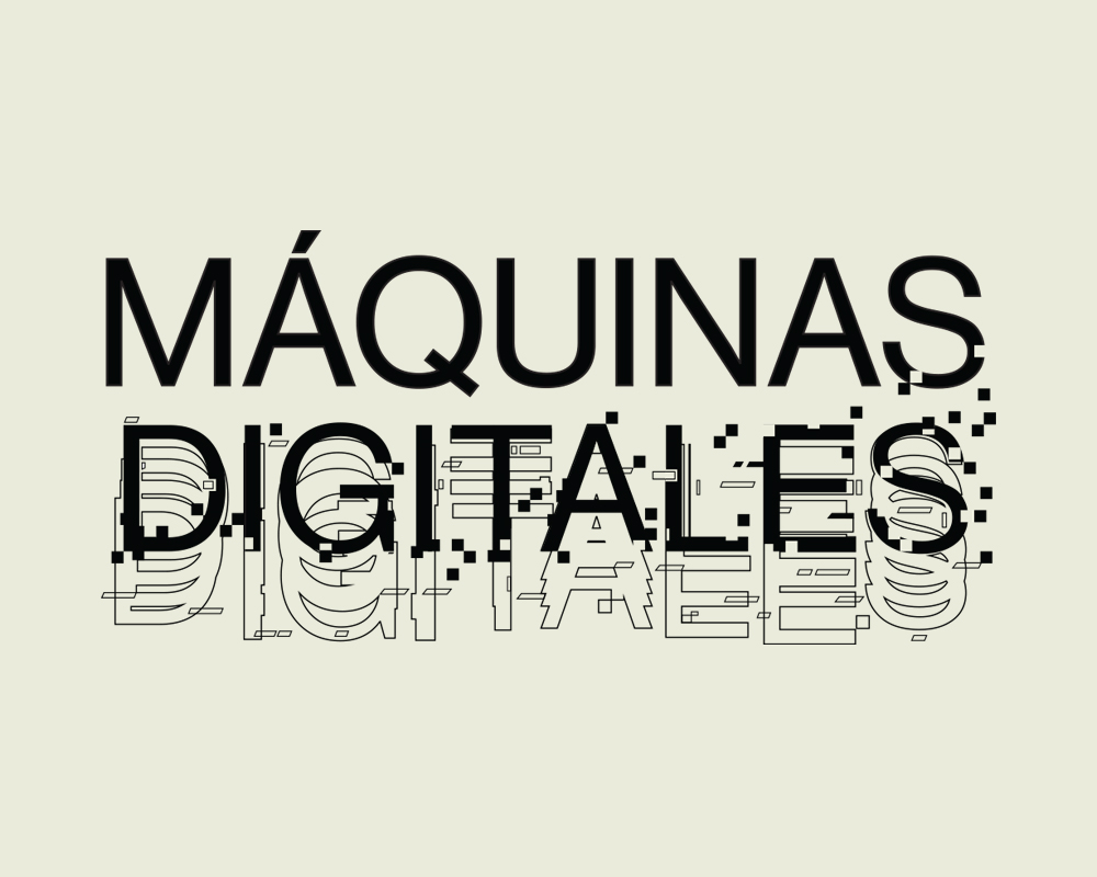
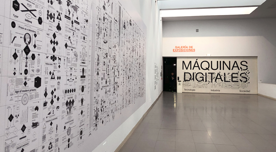
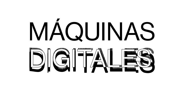
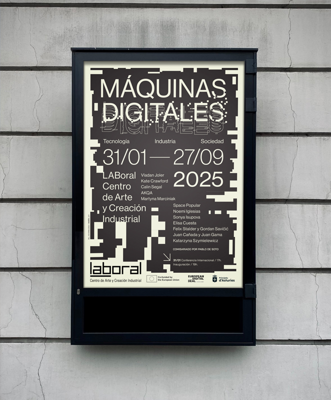
MÁQUINAS DIGITALES
@ Laboral Centro de Arte y Creación Industrial
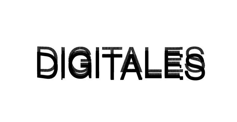
I led the art direction and developed the full visual identity for international exhibition "Máquinas Digitales", held at Laboral Centro de Arte museum in Gijón (Spain). The exhibition explored the relationship between technology, industry and society. The distinct visual identity was designed to make complex ideas accessible through a bold graphic system inspired by industrial aesthetics and the temporary, random error in digital processes. The result unified the exhibition experience across space, print and motion.
SNKR HEADZ DAY / "BRICK BY BRICK" Nike campaing
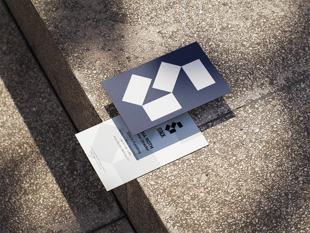
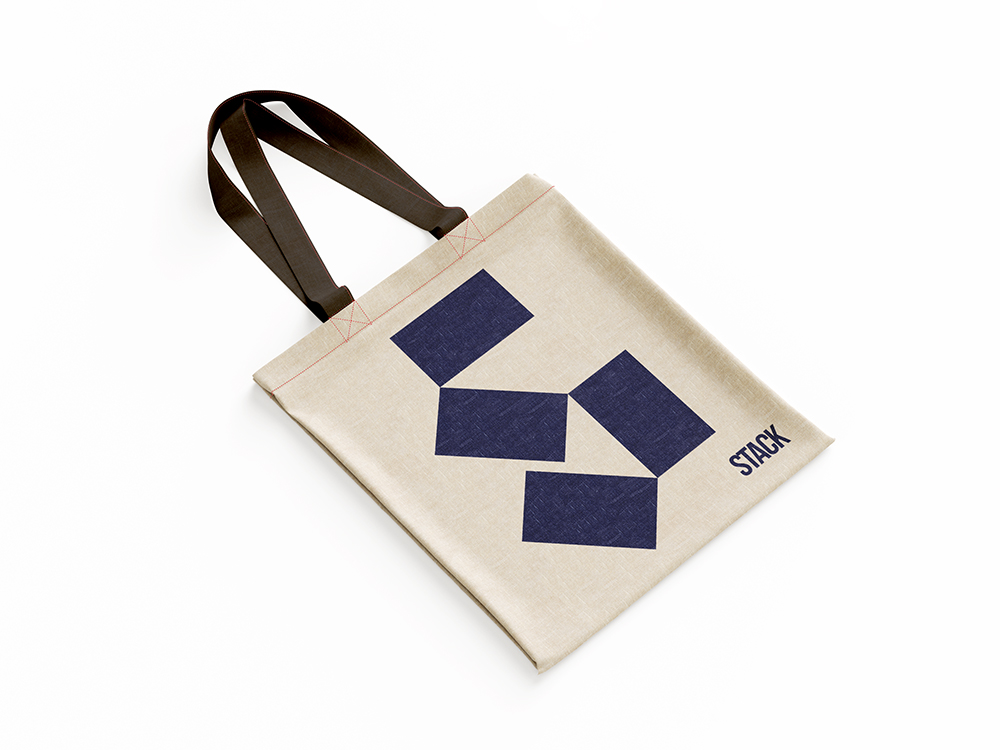
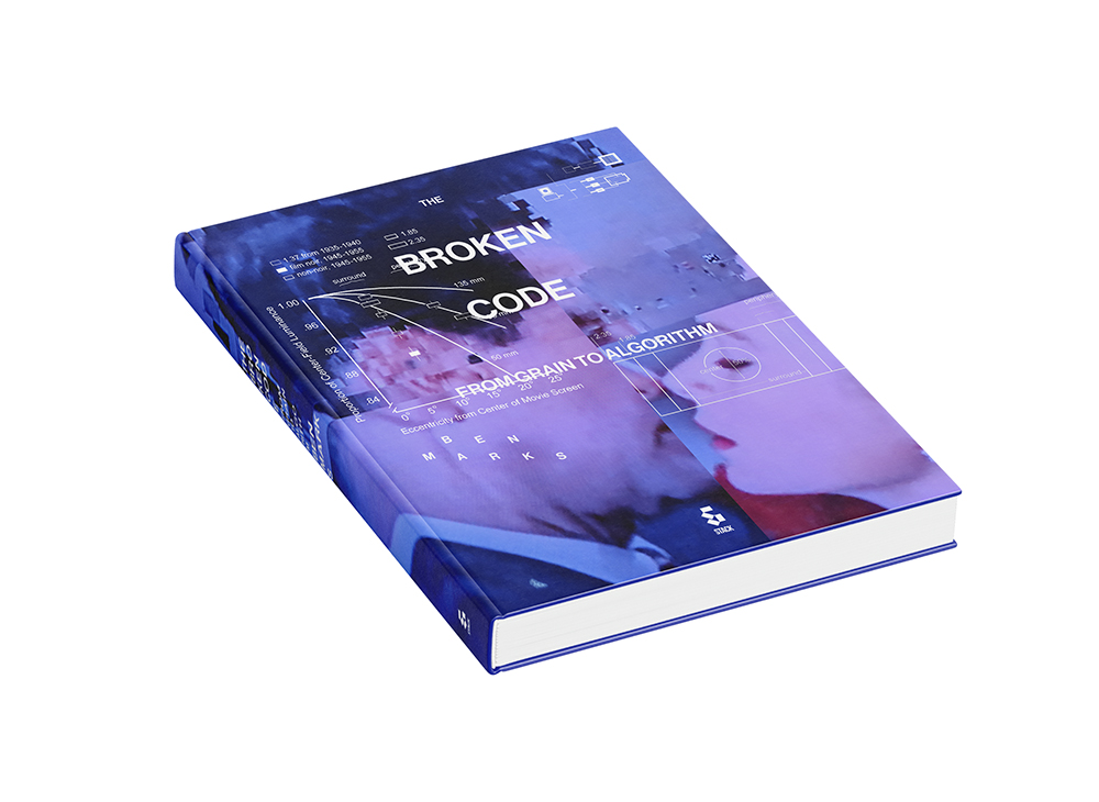
STACK
ForSTACK, I led the full brand development — art direction, logo design and animation, and book design — creating a visual identity as distinctive as the publications themselves. The result is a minimal yet characterful system built with editorial precision, flexible enough to grow alongside the brand.
SNKR HEADZ DAY / "BRICK BY BRICK" Nike campaing
Conceptual project.
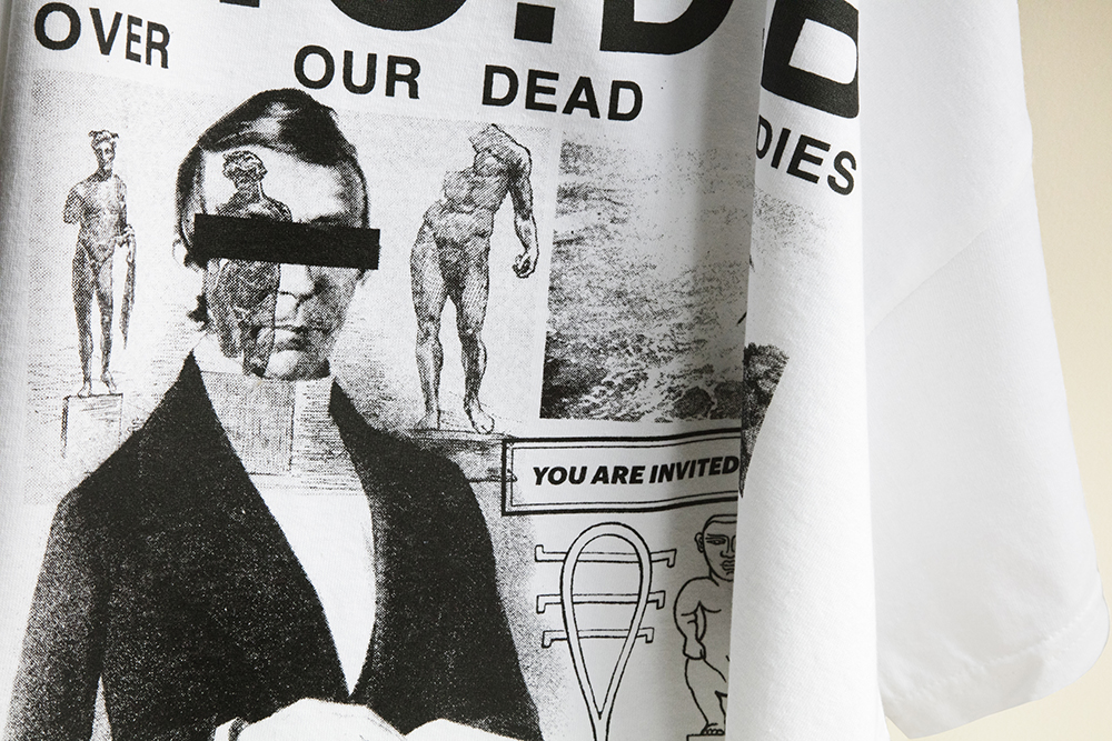
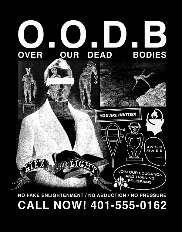
O.O.D.B. tee x Antic Mass
The brief was to create a limited-edition garment that felt connected to the experimental nature of the label. Through a graphic approach focused on texture, symbolism and attitude and inspired by old punk fanzines and DIY posters, the design transformed the T-shirt into an extension of the brand’s visual culture.
SNKR HEADZ DAY / "BRICK BY BRICK" Nike campaing
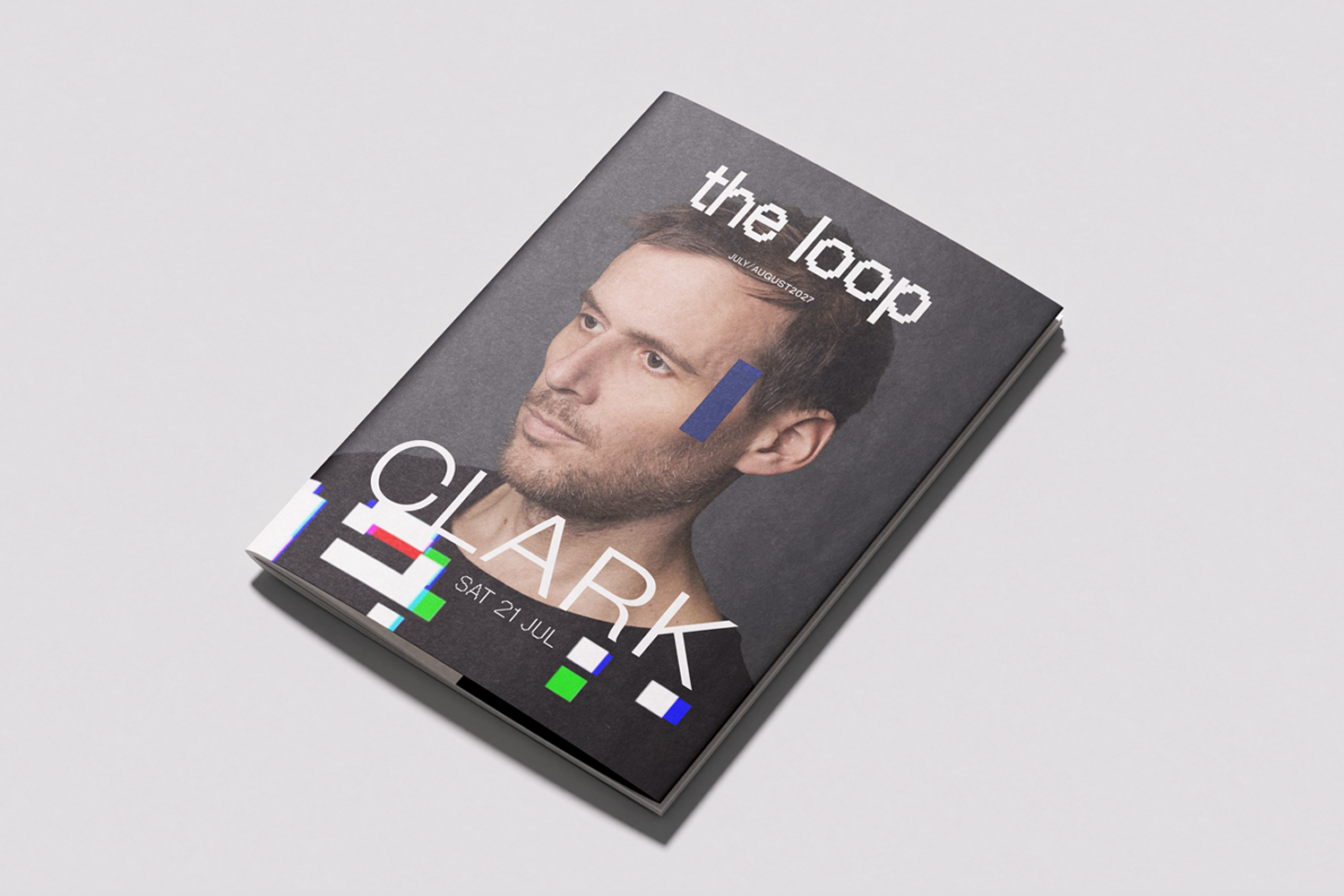
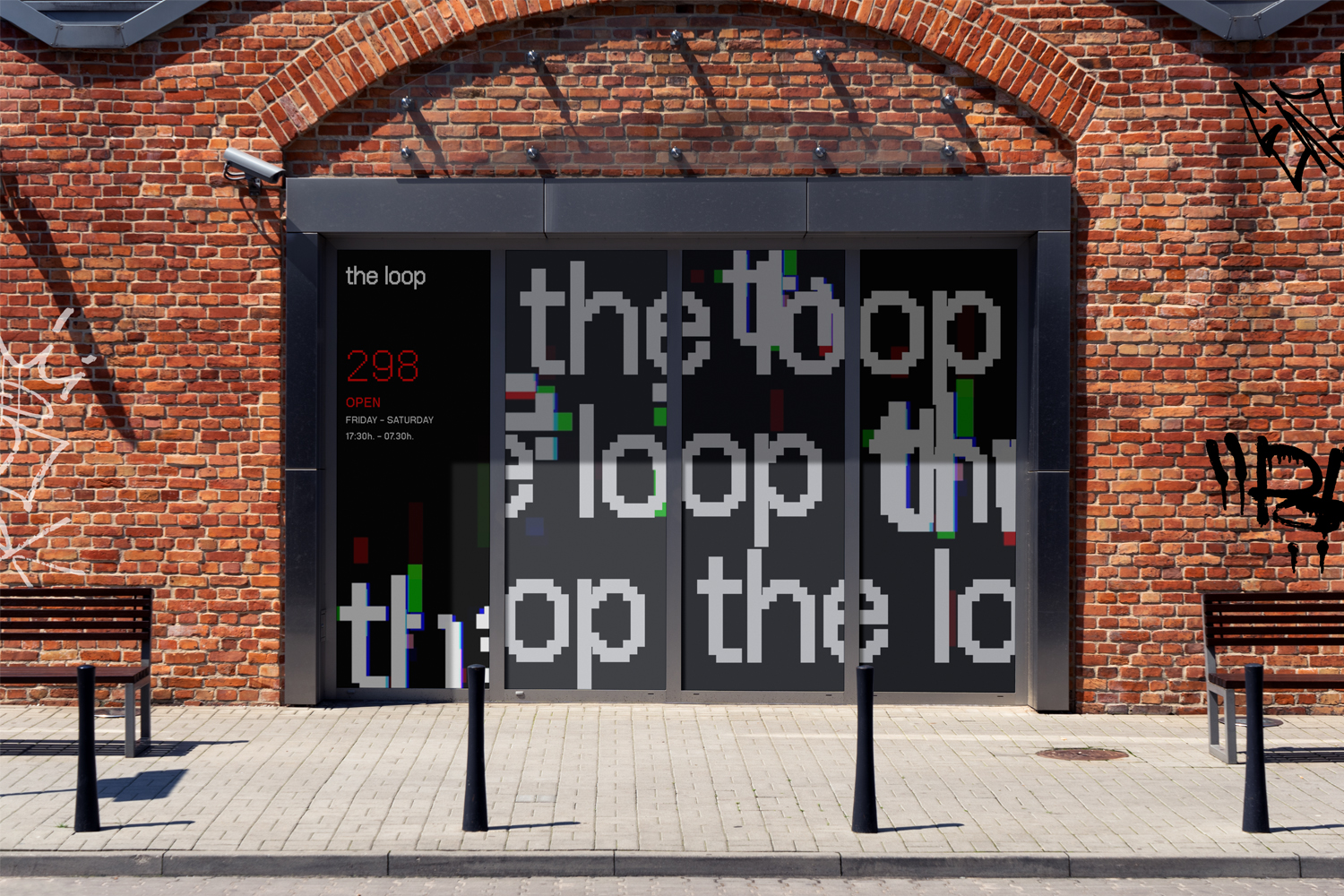
The Loop
For The Loop, a music venue in East London, I developed the full brand — art direction, logo design and animation, club programme and screen animations. The identity is built around a pixel-based visual language, feeling native to both digital culture and the raw energy of the venue. The result is a flexible system that lives seamlessly across print, digital and the club itself.
SNKR HEADZ DAY / "BRICK BY BRICK" Nike campaing
Conceptual project.
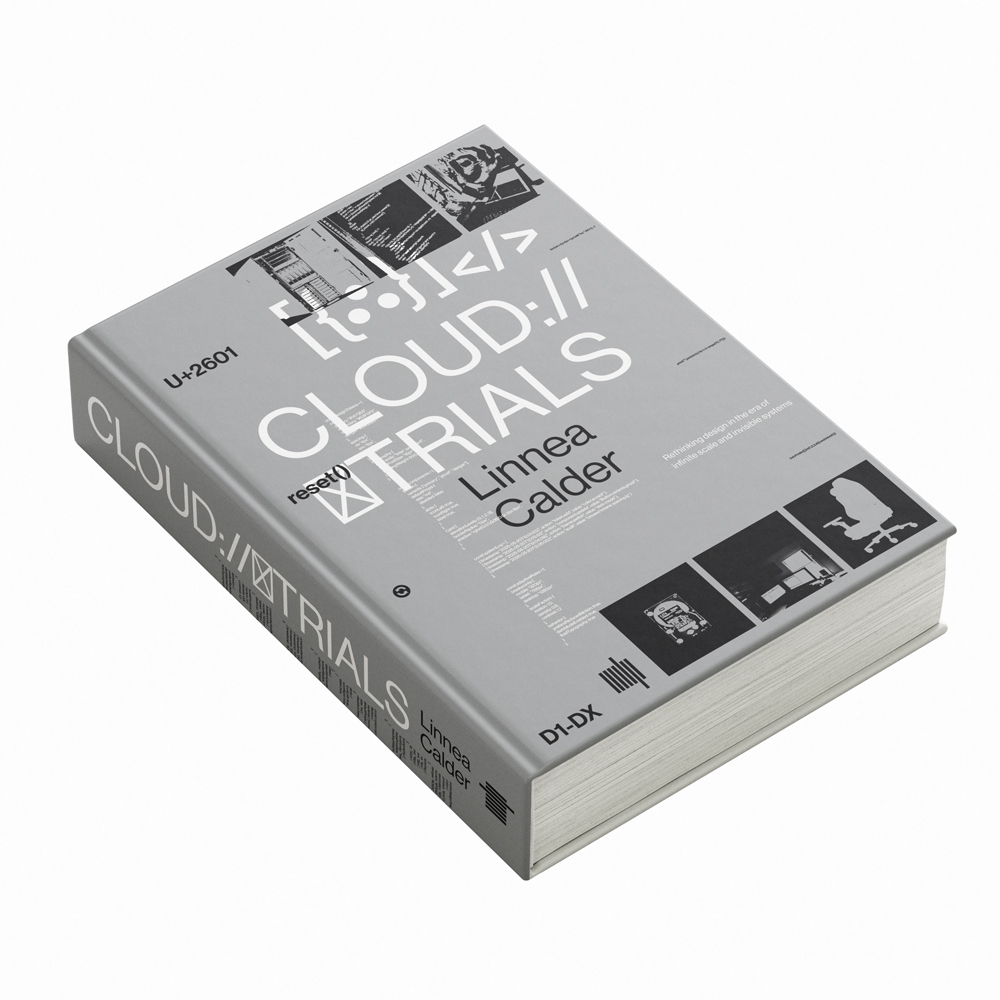
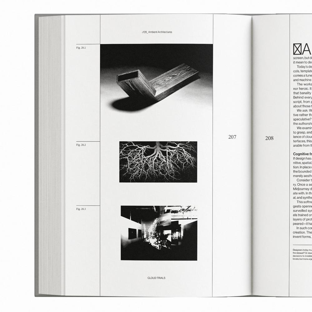
CLOUD TRIALS x Linnea Calder
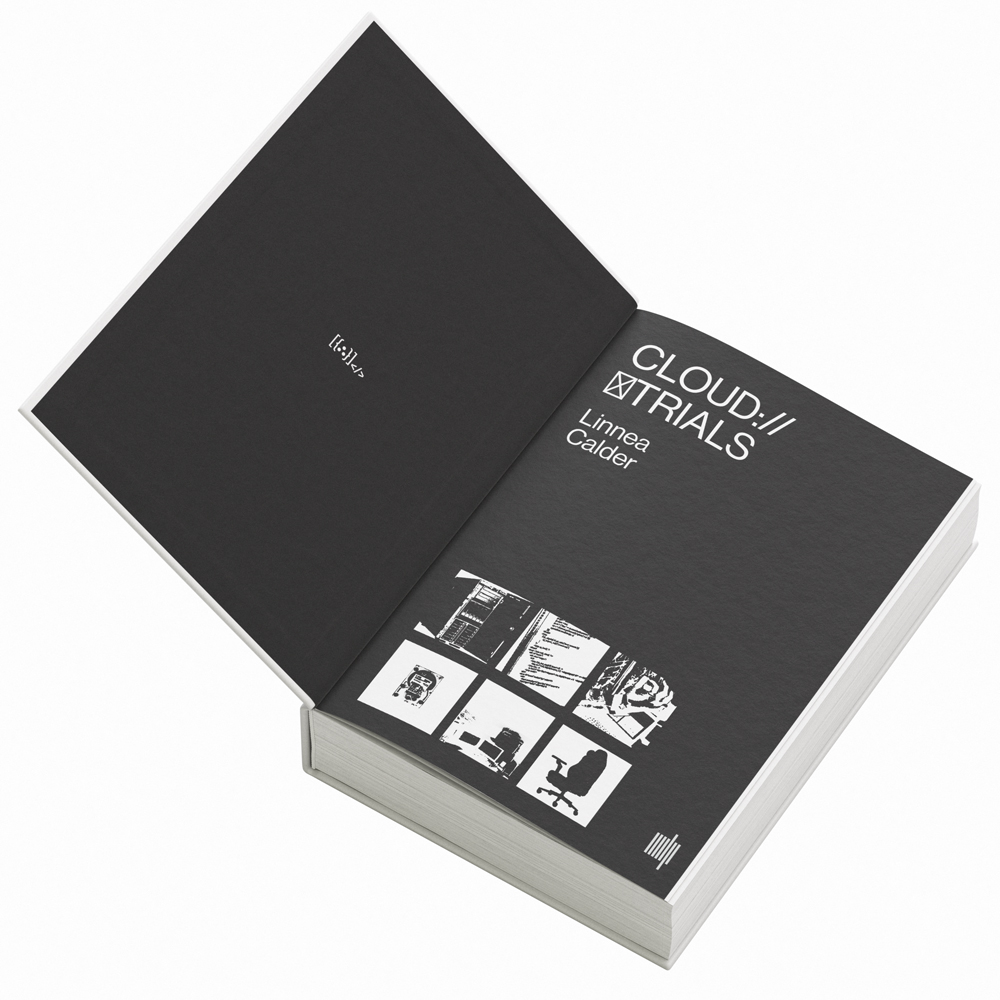
"CLOUD TRIALS. Rethinking Design in the Era of Infinite Scale and Invisible Systems" by Linnea Calder, art direction and book design. The editorial approach focused on creating rhythm, clarity and space for reflection, translating complex ideas into a readable and engaging collectors object. The result reinforced the conceptual depth of the text through design.
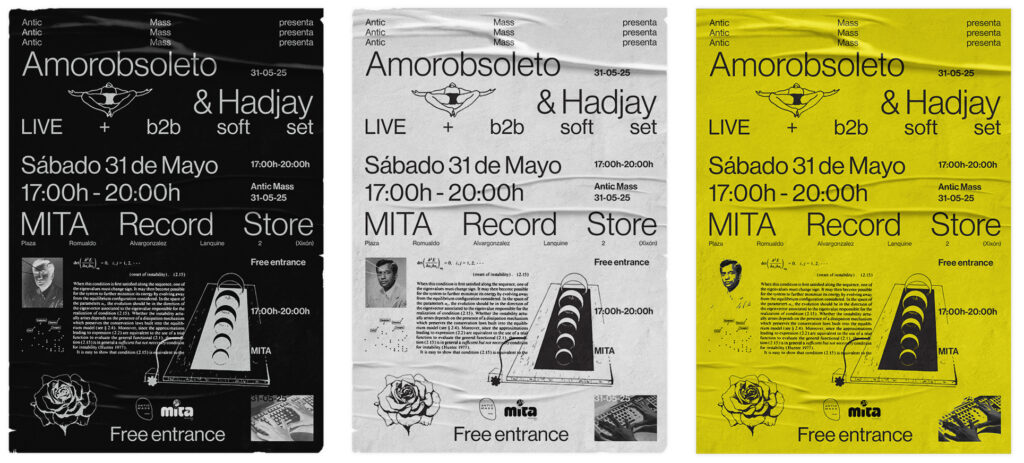
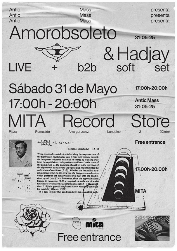
Designed to promote a live event while reflecting the experimental identity of the label and participating artists. The poster system combined strong typography and visual exploration to create a memorable piece capable of functioning both as communication and as a collectible object.
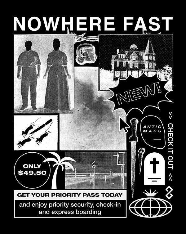
NOWHERE FAST tee x Antic Mass
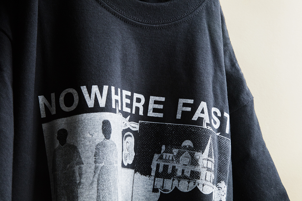
The second drop for the label pushed the graphic language further — leaning into raw typography and layered texture, drawing from the energy of underground print culture. A limited-edition piece designed to feel like a collector's object as much as a garment.
SNKR HEADZ DAY / "BRICK BY BRICK" Nike campaing
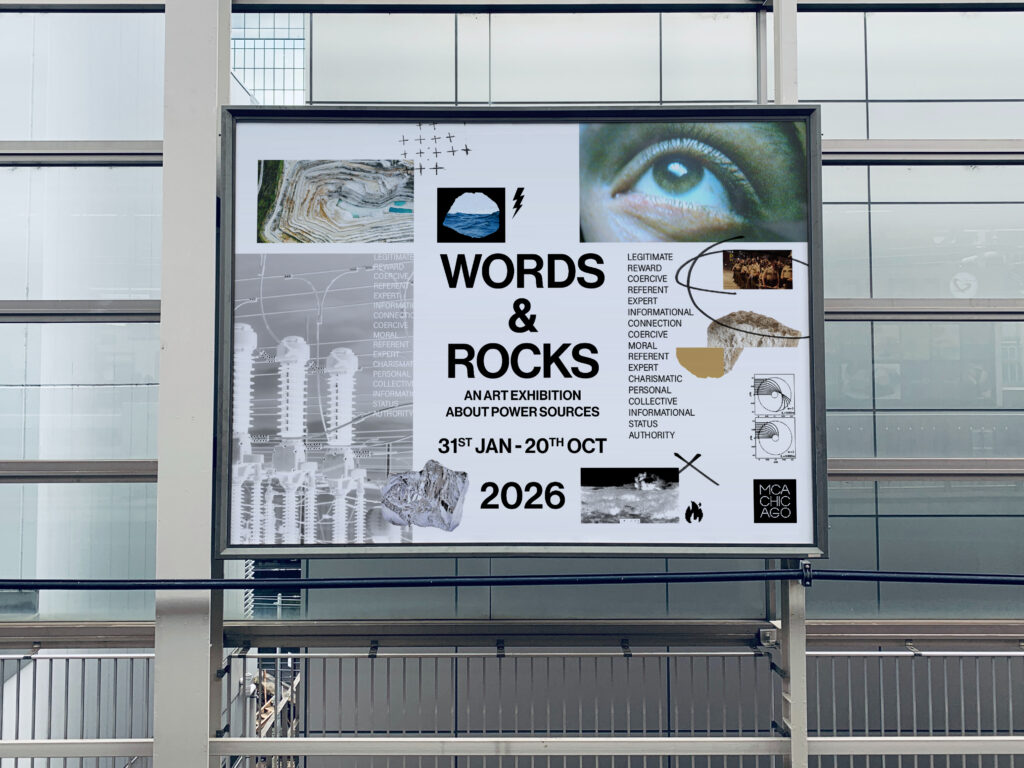
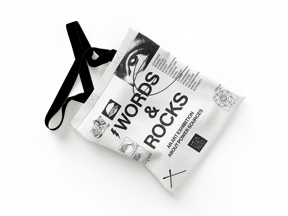
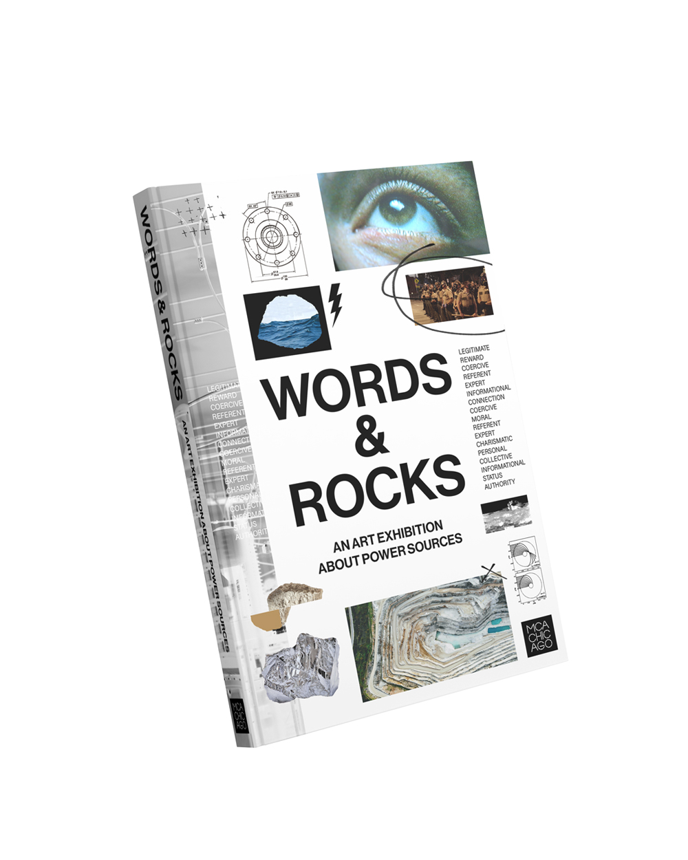
WORDS & ROCKS Exhibition @ MCA Chicago
This exhibition at the MCA Chicago, examined the relationship between language, materiality and power. The identity system was designed to connect these themes through bold typography, motion and environmental graphics. The result created a coherent, dynamic visual experience across multiple touchpoints.
An ongoing exploration of movement, rhythm and typographic behaviour. The project investigates how motion can transform type into a satisfying visual experience, using experimentation as a tool to discover new visual possibilities.
SNKR HEADZ DAY / "BRICK BY BRICK" Nike campaing
Personal project. Work in progress.
MAZY MAZY / Issue #2
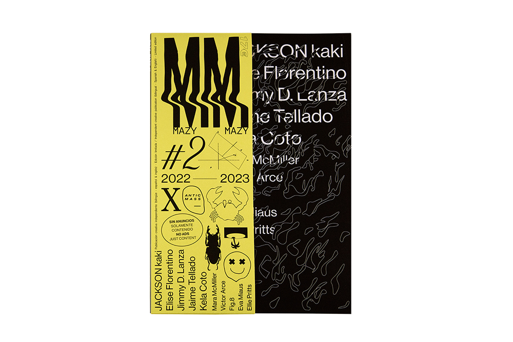
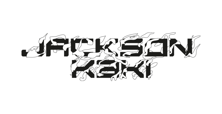
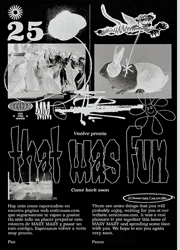
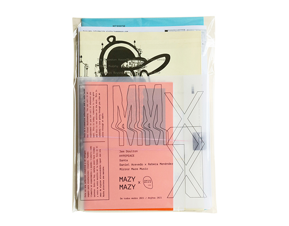
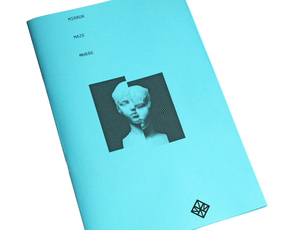
The objective was to build a platform for diverse creative voices while maintaining a strong editorial identity. Through my own curation, art direction and design, the publication balanced multiple perspectives within a coherent visual framework, strengthening its position as an independent cultural magazine.
SNKR HEADZ DAY / "BRICK BY BRICK" Nike campaing
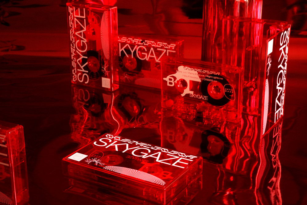
Nostalgigia x SKYGAZE
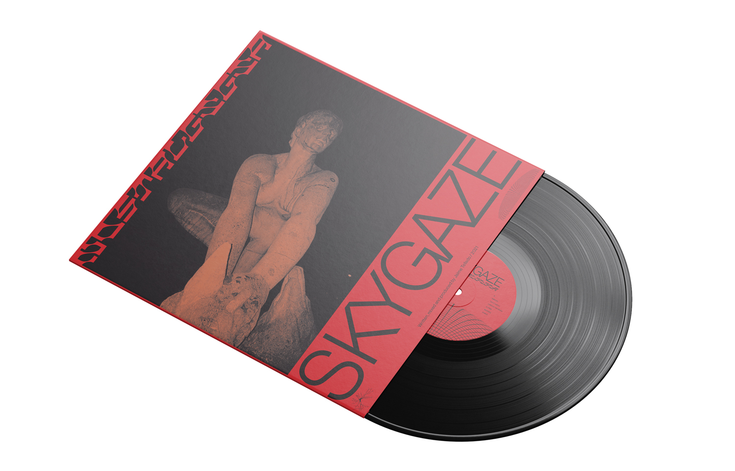
For this conceptual album, rooted in Gijón (Spain) — the artist's hometown — I handled the full art direction and design, and produced, directed and edited the music video for the single "I.C. Park". The entire visual identity is a tribute to the city, weaving iconic corners and textures of Gijón into a cohesive narrative that extends the emotional tone of the music beyond sound. A project where image and place become inseparable from the music itself.
SNKR HEADZ DAY / "BRICK BY BRICK" Nike campaing
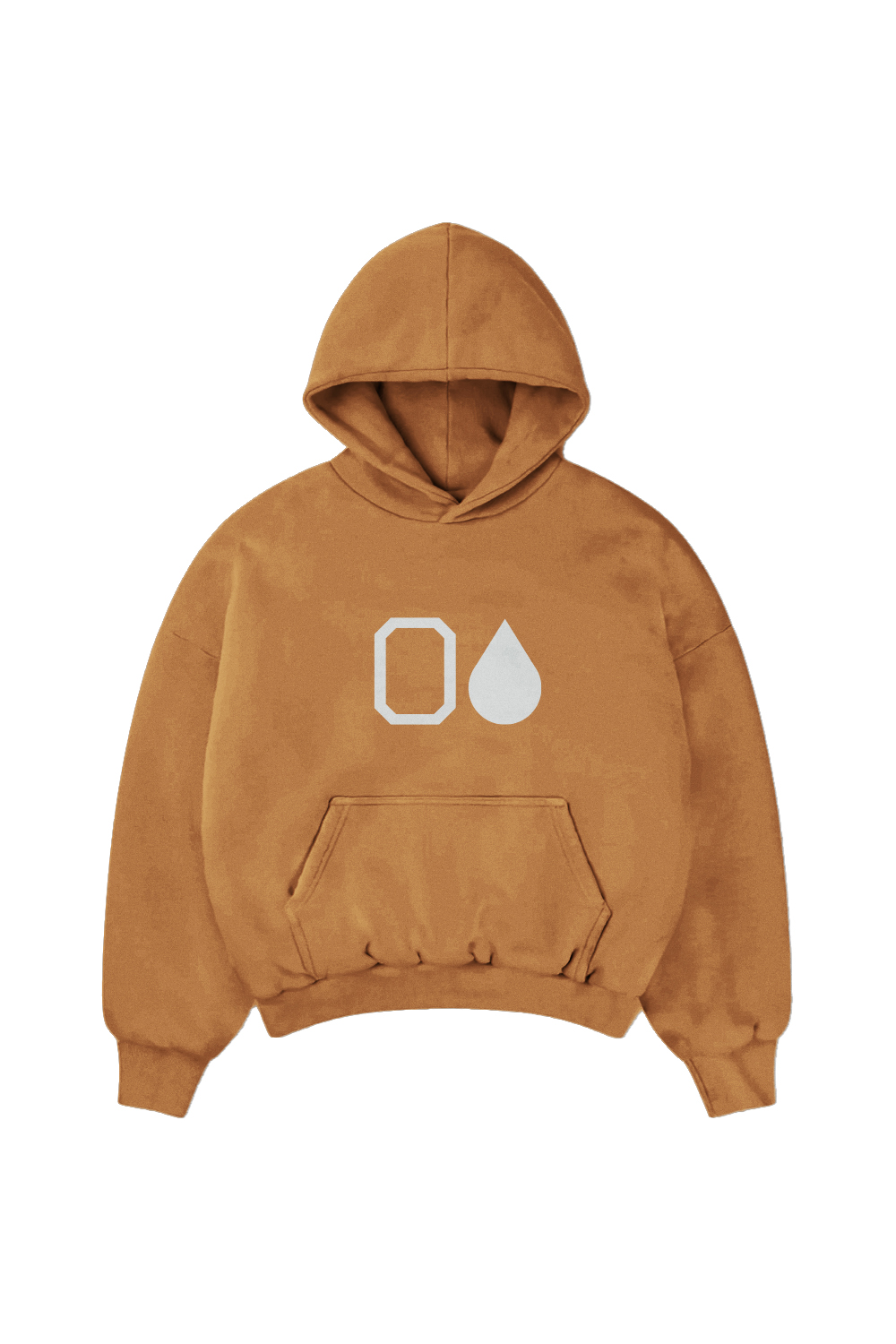
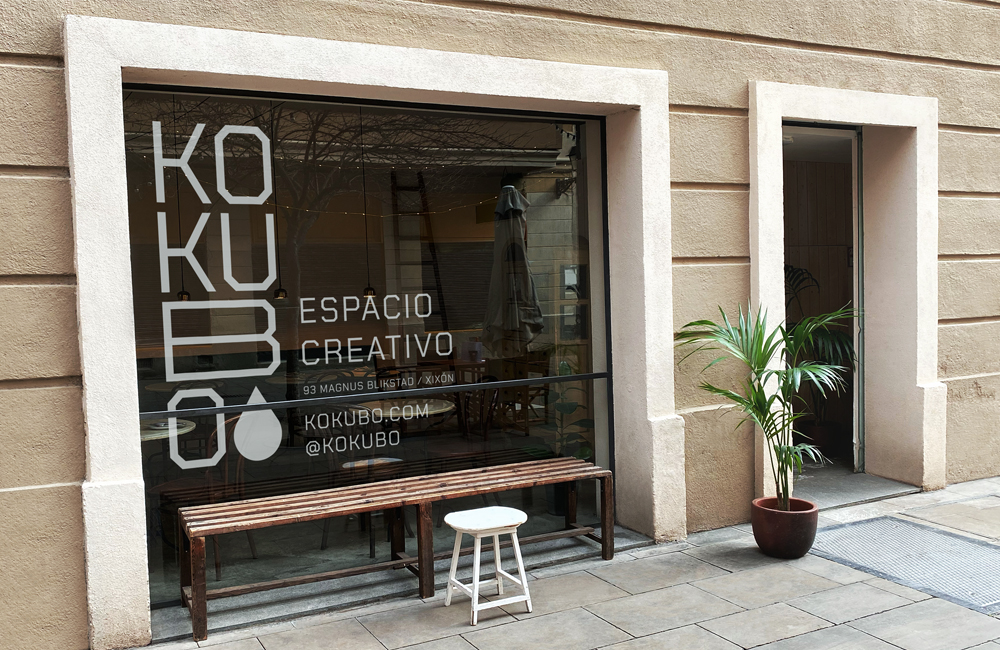
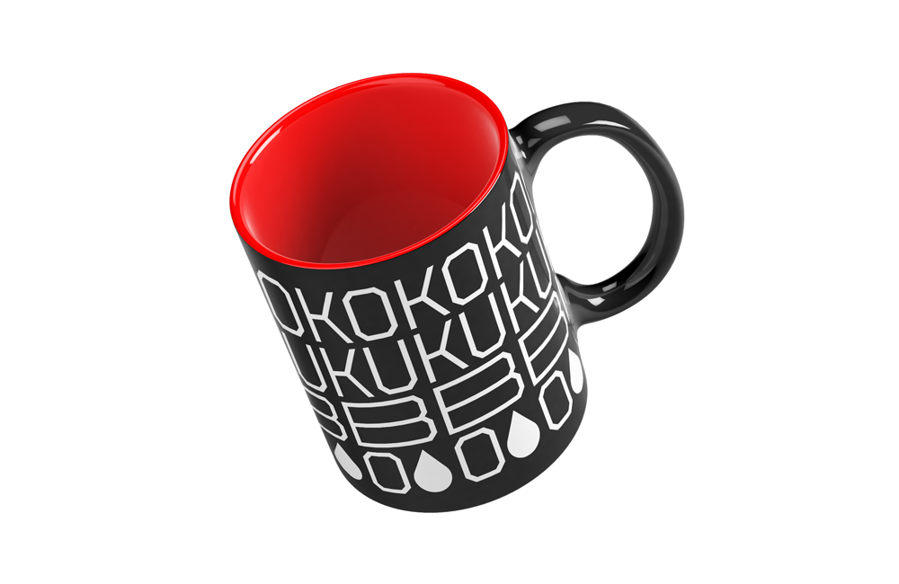
KOKUBO Espacio Creativo
KOKUBO needed an identity capable of representing both a creative space and a print workshop. The solution combined craftsmanship and experimentation through a flexible visual language that could evolve across physical and digital environments.
SNKR HEADZ DAY / "BRICK BY BRICK" Nike campaing
MAZY MAZY / Issue #1
For MAZY MAZY's first issue, I handled curation, art direction and design — coordinating contributors across photography, fashion, music, poetry and illustration, and pulling it all together entirely self-managed and on a shoestring budget. Think fanzine energy with serious editorial ambition. A distinctive platform for art, design and creative culture, with a voice clear enough to stand on its own from day one.
SNKR HEADZ DAY / "BRICK BY BRICK" Nike campaing
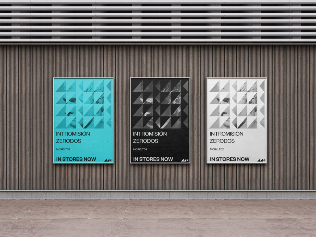
Microkult
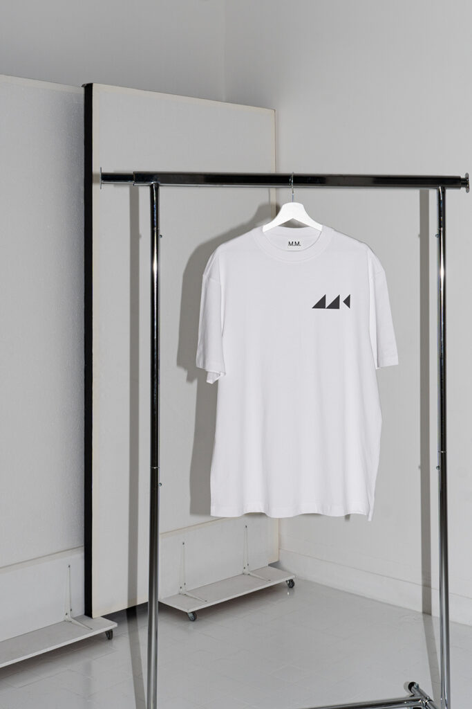
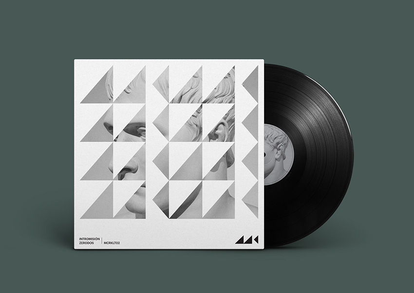
For Microkult, an independent minimal techno label, I developed the full visual ecosystem — identity, logo design and animation, album covers, merchandise and promo materials. The logo is built around the triangle, the most minimal of geometric forms, as a nod to the label's sonic identity. The result is a bold, adaptable system built to hold its own across releases.